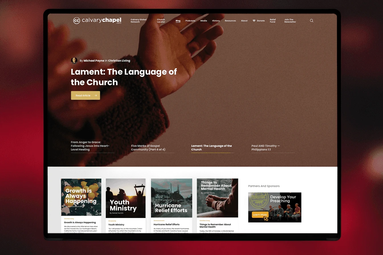
The Most Complex/Rewarding Project of My Career
CalvaryChapel.com was never just a website to me.
When I was a youth pastor, I’d visit the site often, hungry for insight, encouragement, and theological resources. I loved learning from the pastors and leaders who wrote on the site, and personally looked up to many of them as mentors and guides.
So when I was asked to lead its redesign years later as Content Strategy Director for Calvary Global Network, I knew I wasn’t just redesigning a website. I was stewarding something important.
This was the most complex, exhausting, and rewarding design project of my career. Here’s how I rebuilt it.
01Escaping SilverStripe: A Migration Odyssey
(“The old bones still had weight… but they were cracking.”)
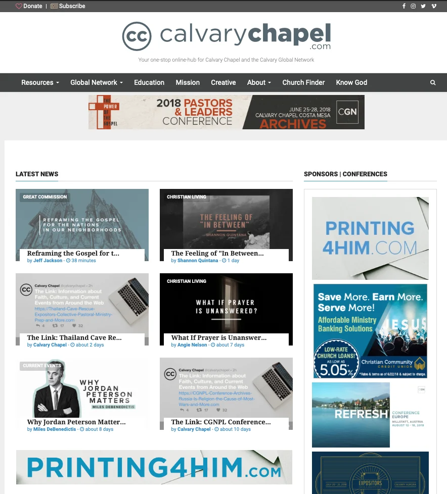
CalvaryChapel.com had been redesigned more times than anyone could count (the earliest version, I believe, was built in the 90s!)
The bones of the 2018 site were built on SilverStripe, a platform that had served faithfully in a previous era, but by the time I took the reins, we’d simply outgrown it.
We needed something more dynamic, something scalable. I believed WordPress was the right call, a controversial take internally. Some pushed back. But I stood firm, because I knew what this platform needed to become.
Multiple staffers warned me:
“This project is a beast, dude… it’ll eat you alive.”
They weren’t wrong.
The real challenge was the migration: more than 1,400 articles and resources had to be preserved.
There was no clean export tool, no plug-and-play shortcut.
So I spent months architecting a custom strategy, scripting, mapping, manually verifying, to ensure every piece of content made it safely into the new system.
Not just copied. Transplanted.
02A New Front Door: Leading with Legacy
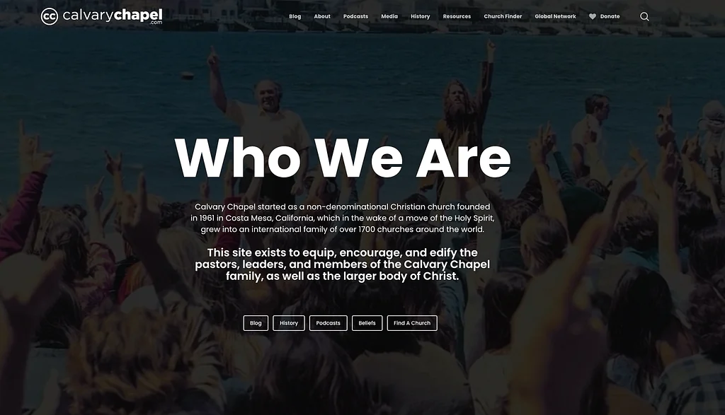
With the backend finally rebuilt, it was time to rethink the front.
We launched with an homage: Chuck Smith and Lonnie Frisbee, icons of the Jesus Movement, greeting every visitor.
Not just nostalgia, but a clear anchor: this is who we are, this is where we came from.
03Blog: Beautiful Theology Deserves Beautiful Typography & Imagery
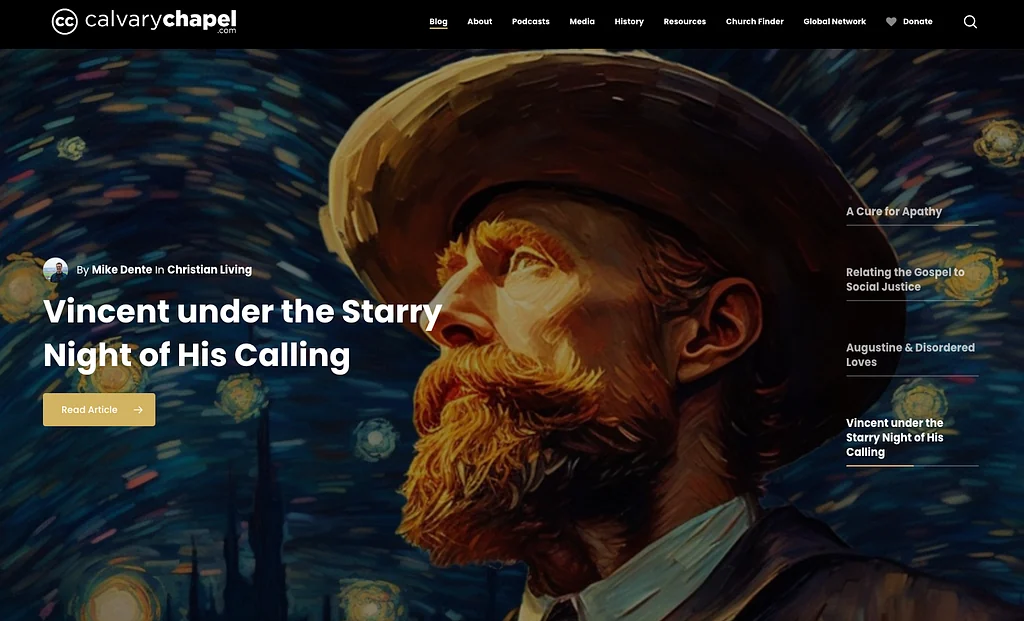
One of my deepest joys was taking over as content manager for the site, a role similar to that of an editor in chief. I didn’t just design it, I rebuilt the entire editorial ecosystem.
That meant:
- Leading a team of 15–20 volunteer writers and managing CGN’s content team.
- Reworking editorial flow and submission pipelines.
- Designing systems that elevated readability and visual storytelling.
- Building featured content blocks and category hierarchies from the ground up.
If theology is meant to stir hearts and minds, then the interface that delivers it better not be bland. Articles now breathe, spacious layouts, bold feature images, and inviting visual rhythm.
04Beliefs: Make It Clear, Make It Honest
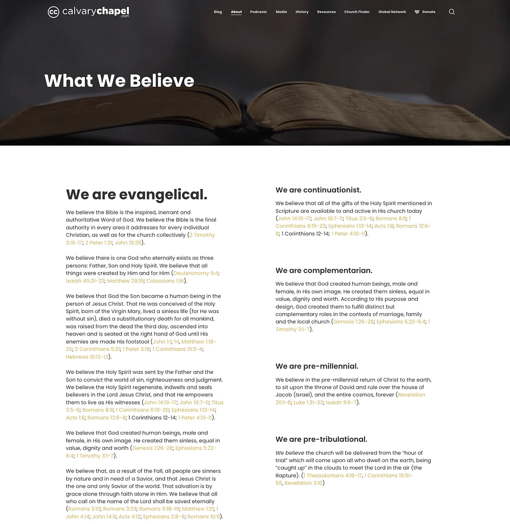
Calvary Chapel has deeply held beliefs, and presenting them with clarity and conviction was key.
I stripped away clutter, resisted the temptation for bloated design, and created a clear, accessible beliefs page with scriptural references and strong visual flow.
This section is often one of a visitor’s first touchpoints.
It needed to speak plainly.
05Categorization & Archives: Taming the Chaos
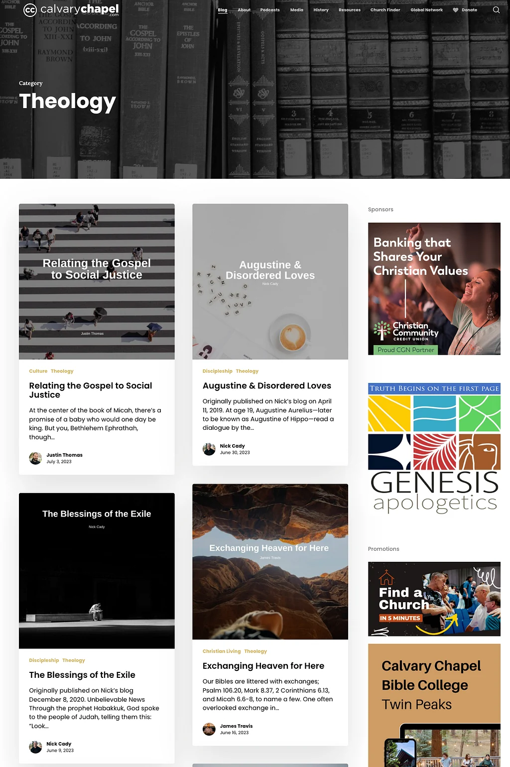
We inherited years of articles, blog posts, videos, podcasts, event updates, and other resources, all flowing through one long feed with almost no meaningful categorical structure. Theology sat beside discipleship, culture, conferences, and ministry news. Valuable content existed, but there was no clear way for people to explore it by subject.
I led a full content audit and rebuilt the site’s category structure, separating the archive into useful subjects like Gospel, Culture, Theology, Discipleship, and more so people could browse by what they were actually looking for.
06Breathing Life into the Past
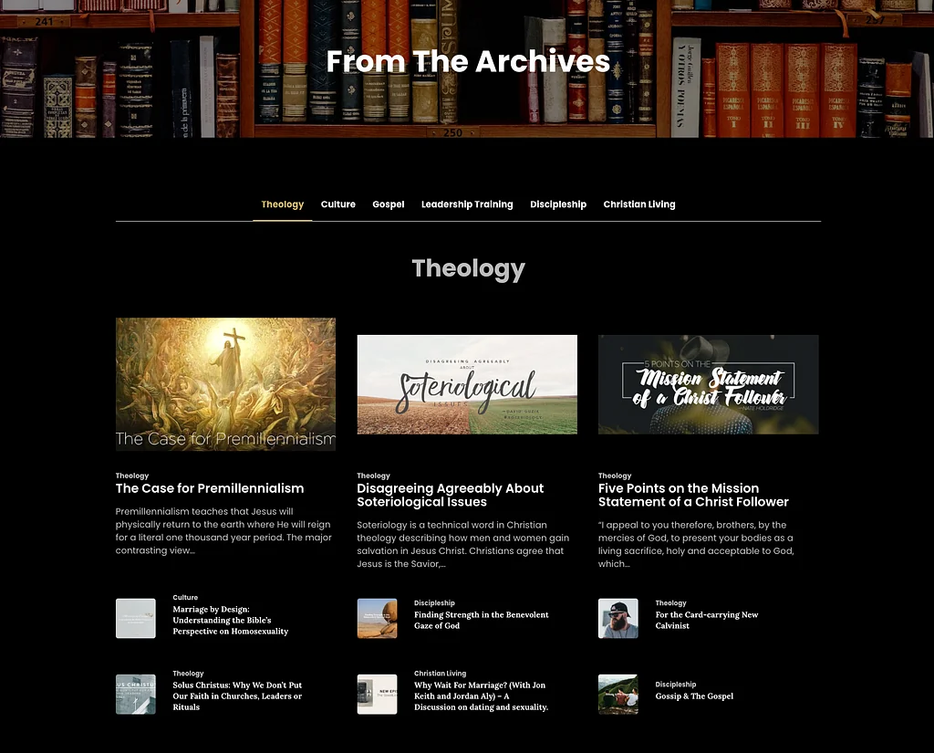
Most sites have archives. Few make you want to visit them.
I designed a shuffling archive feature that dynamically refreshes on page load. This gives old articles new exposure, a resurrection loop for evergreen content.
Every time you visit, you meet new (old) content.
It keeps the site alive and surprises returning readers.
07The Timeline: Honoring the Roots
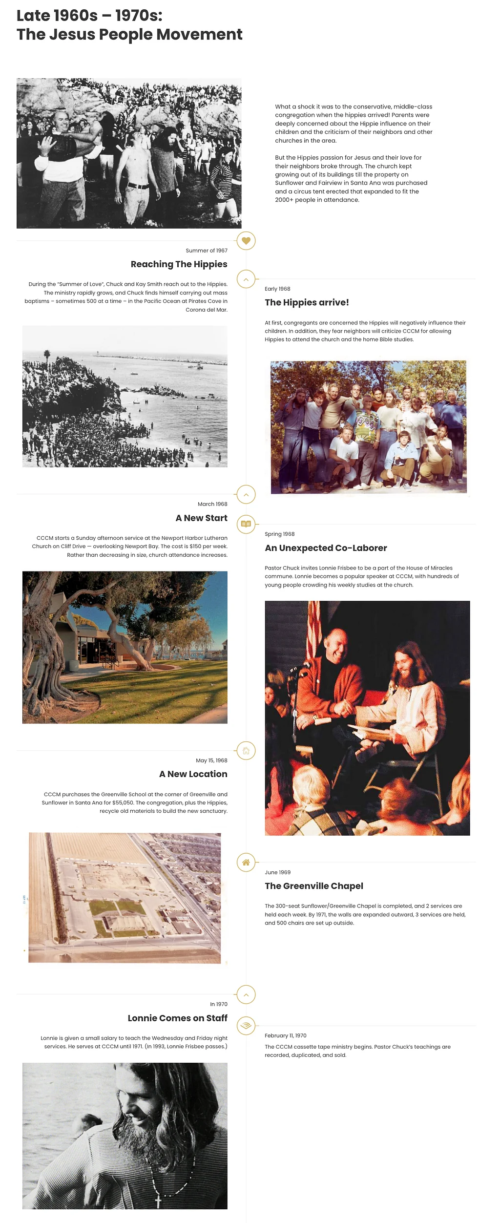
Working with my colleague Britt Taylor, we built an visual timeline of the Jesus People Movement, Calvary Chapel’s origin story.
It blends photography, story blocks, and milestone markers to walk visitors through a historical moment in the Church that still echoes.
08Authors Page: Honor the Contributors
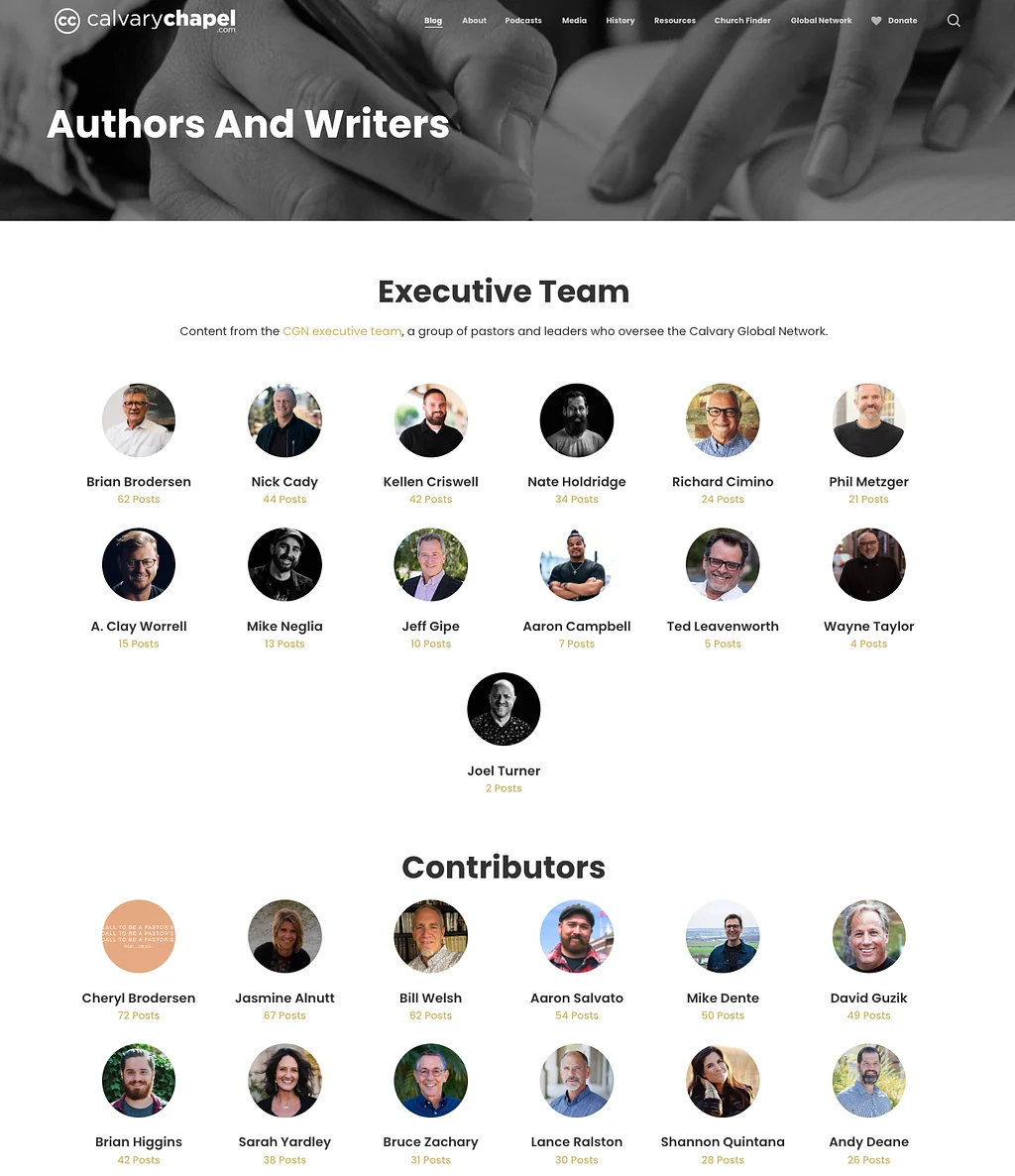
CalvaryChapel.com is a hub of voices across generations.
I didn’t want those voices buried.
I built an Authors & Writers page that put faces to names and showcased each person’s contribution.
Visitors could now browse by writer and see every article they’ve shared.
My goal was to honor all the years of hard work by these pastors and leaders and help more people discover their work!
09Podcast Integration: From Silence to Signal Boost
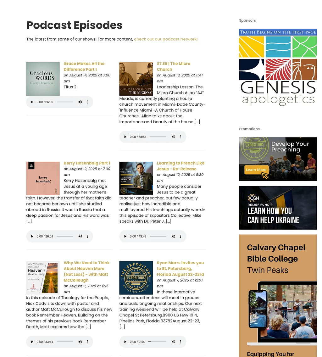
Before the redesign, CGN’s podcast shows were floating in the ether, no centralized directory, no visibility.
As the founder and director of the CGN podcast network, I:
- Built podcast network infrastructure from scratch
- Designed podcast listing pages with dynamic RSS pulling
- Featured episodes on the homepage
- Saw listenership explode on average from 100–300 plays to 3,000–6,000+ per episode post-launch across many of our shows.
The platform became the signal boost we never had. I was overjoyed to hear how many of our pastors and leaders were seeing their shows reach a wider audience than ever before!
10Chuck Smith Library: Legacy Meets Utility
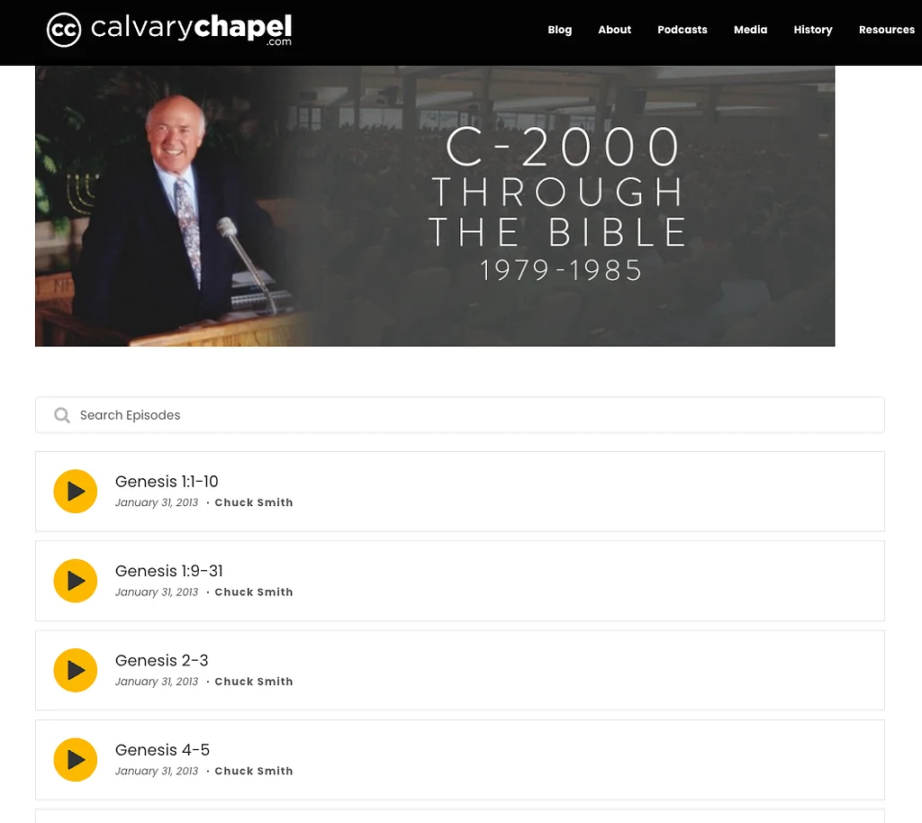
Pastor Chuck Smith’s teachings are foundational to Calvary Chapel, so I built a searchable teaching library for his most popular series (like the C2000 series).
This was digital preservation, a way to keep his voice echoing for the next generation.
11The Church Finder: My White Whale
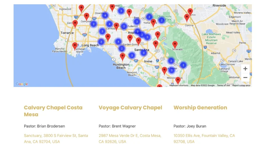
This feature almost broke me. 😆
We had a database of over 1,000 churches, each with different affiliations, statuses, and data quirks.
The existing database was ancient and brittle.
I led the architecture and UI/UX redesign of a completely new system. I pulled in AJ Caldwell, a fantastic coder and developer I had worked with in other freelance projects.
Here’s what we built:
- A no-code back-end that allowed staff to manage the data without breaking anything
- A live-updating front-end with filtering by country, zip code, and city
- A beautiful, intuitive interactive map to help people find a local Calvary Chapel church
It was the most technically complex challenge of the entire project.
But we nailed it. 👊
12Final Thoughts
Rebuilding CalvaryChapel.com was a sacred design responsibility.
It demanded my full range: content strategy, brand management, design systems, editorial strategy, database logic, pastoral sensitivity, user empathy, and aesthetic instinct.
It took over a year.
And it was worth it.
I’m proud of what we made. Not because it’s flashy. But because it serves, real people, real churches, real seekers.
That’s the kind of design I want to keep doing.
Have a project this complicated?
If you’re dealing with an outdated platform, a difficult migration, or years of content that have become hard to manage, tell me what needs to change.
Led by Aaron as Content Strategy Director at CGN. Church finder developed with AJ Caldwell.
This account describes the project at the time of writing; screenshots may differ from the current client site.