
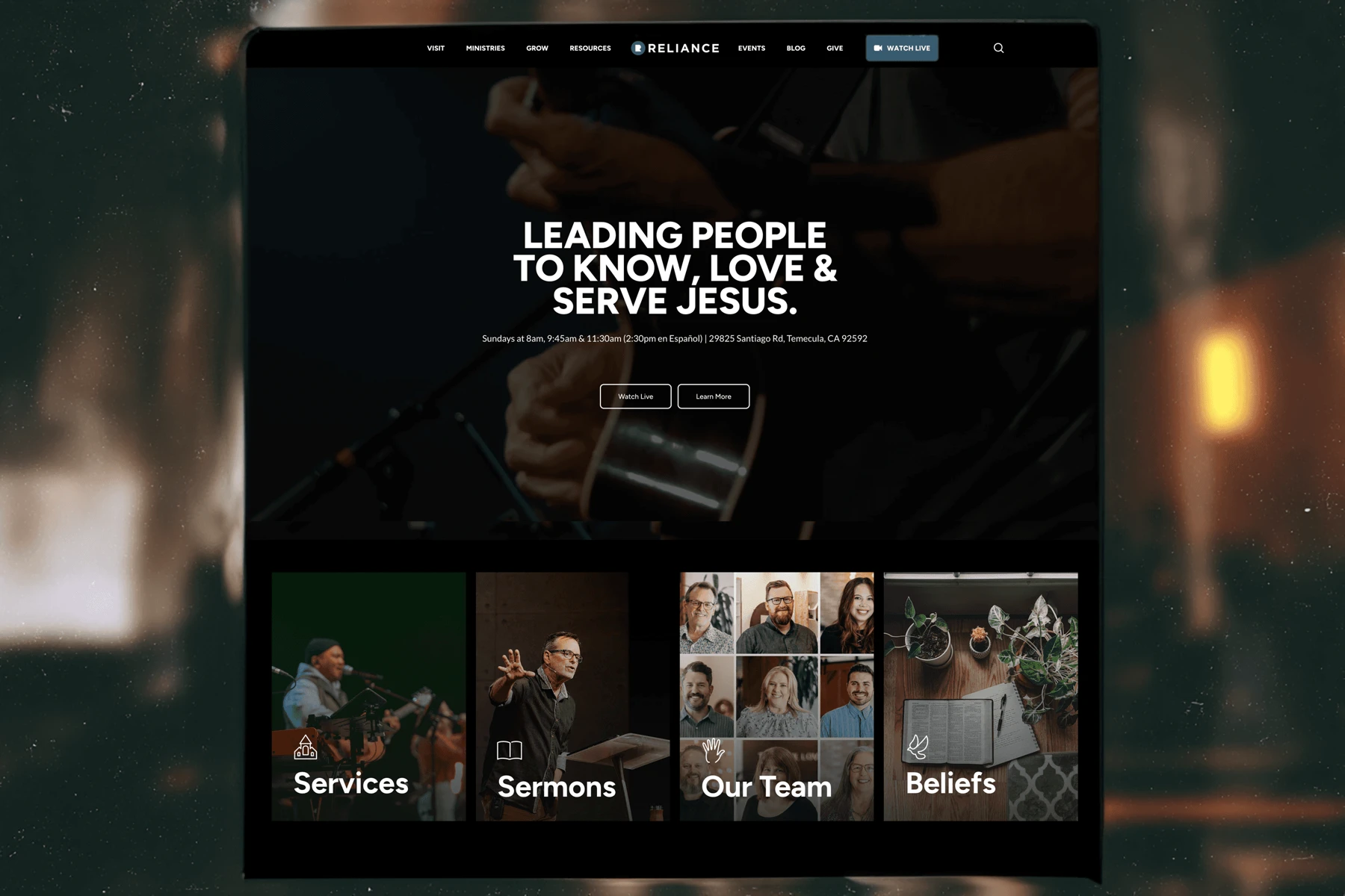
Design That Feels Like Church, Not Just a Church Website
01“Hey man… can you help us?”
That’s how this project kicked off.
The team at Reliance Church had seen my work for CalvaryChapel.com and CGN. They liked the tone. They liked the simplicity.
But most of all, they were frustrated with their current setup. The homepage had been reduced to a series of oversized, image-heavy scroll blocks, something between a broken slideshow and a church-themed PowerPoint.
Everything was functional… technically. But it wasn’t serving people. It wasn’t telling the story of who they are.
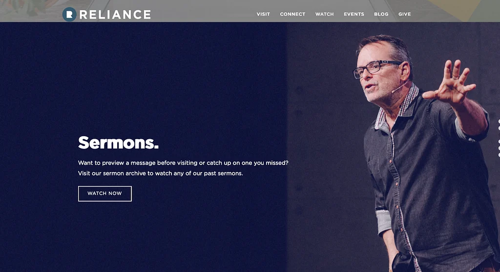
So I stepped in with a deeper strategy and design engagement, taking the time to understand the church and build the site properly.
02A Homepage With Purpose
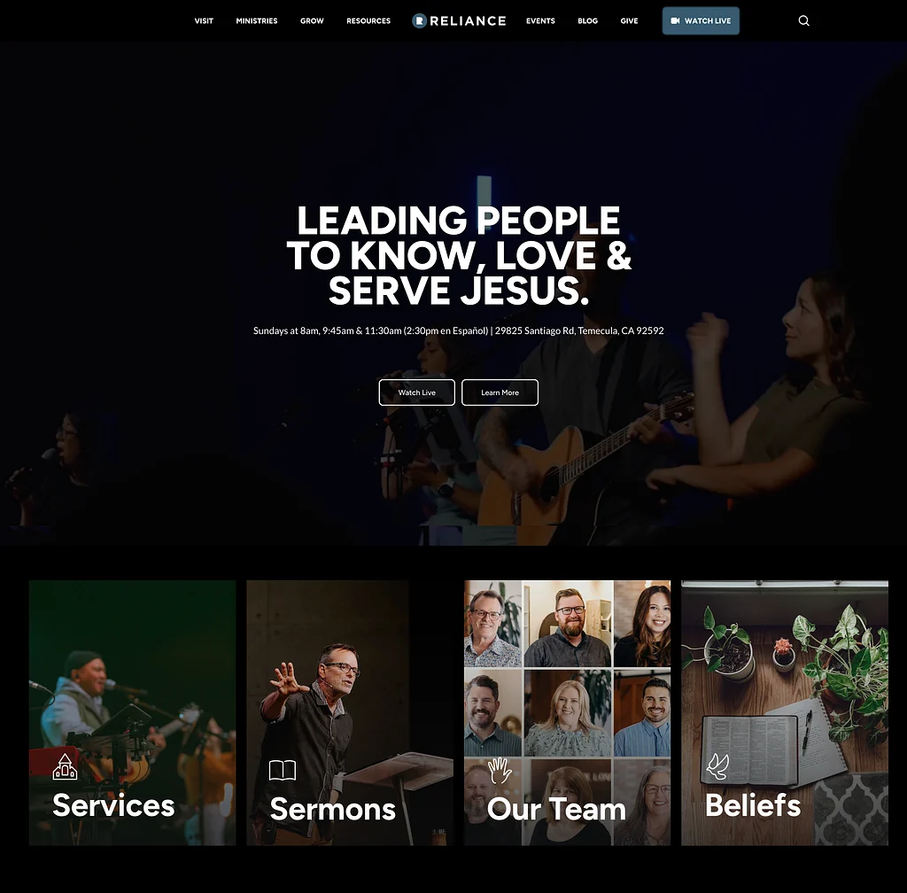
We started with the front door: the homepage.
I didn’t just want this to be pretty, I wanted it to instantly communicate the identity of the church.
So we led with a powerful background video: clips of worship, the teaching team in action, courtyard community time. No cheesy B-roll. Just the real life of the church, front and center.
Right there with it: the mission. “Leading People to Know, Love & Serve Jesus.”
And just below that: service times and location, clear as day. Not buried, not “click to find out.” It’s just there, ready for newcomers to say: “Oh, cool, this is when I show up.”
Just under the hero section, I dropped in a tight, visual grid, a kind of digital app menu. You’ve got quick tiles for sermons, staff, beliefs, and Sunday details.
This is what I mean when I talk about web design as hospitality.
03Navigation That Feels Like an App
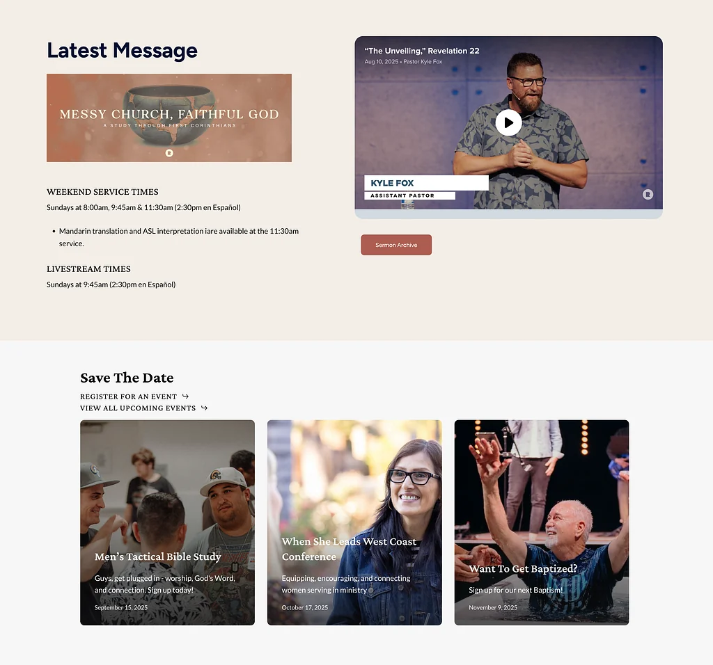
As you scroll down, the next section provides easy access to the latest sermons and most important upcoming events.
The goal was to give the end user exactly what they would be looking for:
- Where do they meet? What time?
- What are the sermons like?
- What’s happening at Reliance?
Each tile is animated, responsive, and thoughtfully styled.
Instead of overwhelming people with choices or hiding links in a hamburger menu, we gave them a clean, intuitive visual map.
You can feel the difference. You’re not lost. You’re invited.
04Real Photos. Real People. Real Trust.
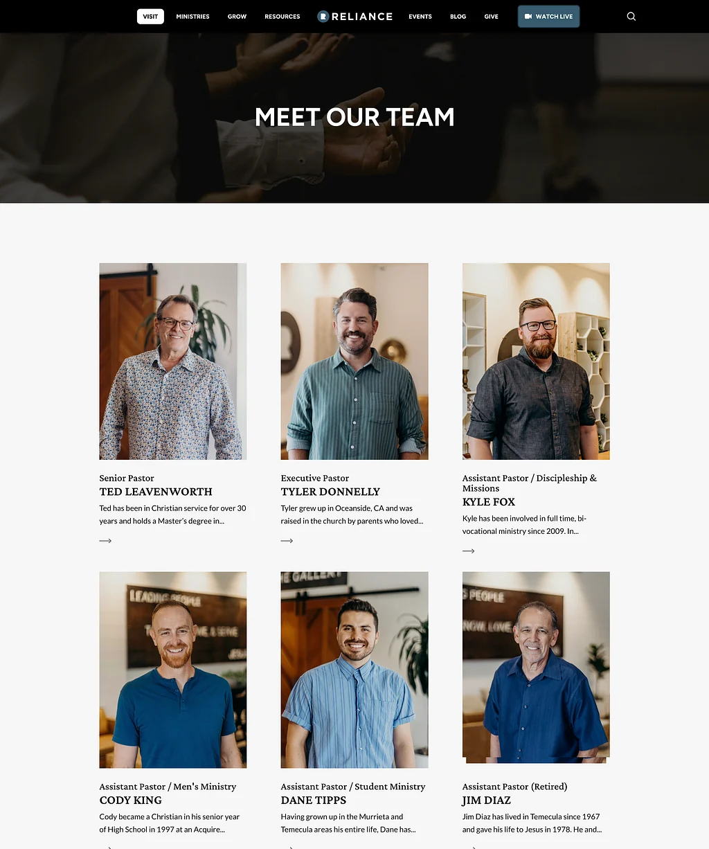
The Reliance team had something that I encourage all my clients to incorporate into their website: incredible photography.
The “Meet Our Team” page became a chance to build relational equity.
You’re not just seeing job titles, you’re seeing the warmth, joy, and diversity of the people who lead the church.
Every photo has personality. It’s not overdesigned.
It just feels true.
05Building With the Admins in Mind
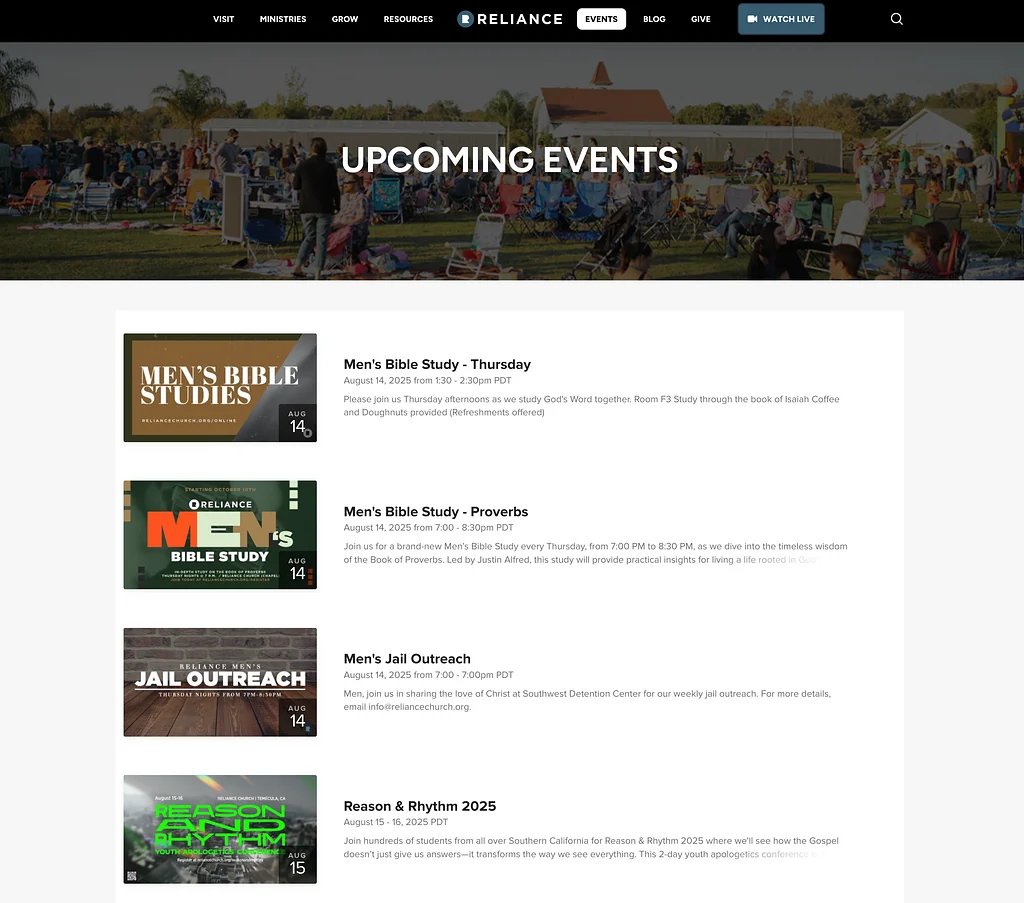
One of the pain points I heard from their staff was the headache of double entry, maintaining events on both Church Center and the website.
So we fixed that.
The new events page syncs directly with Church Center, pulling in the latest events automatically.
That means fewer clicks for staff and up-to-date info for everyone else.
06A Sermon Library That Feels Native
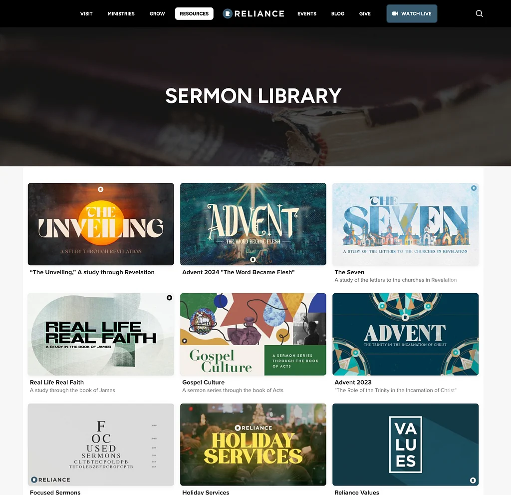
Reliance runs their media through Subsplash, which is great. We embedded the Sermon Library to feel like a native experience. No linking to an off-site portal.
Clean tiles, responsive layouts. Whether you’re looking for the latest message or digging into a past series, it feels cohesive.
Your average churchgoer doesn’t need to know what platform is doing the heavy lifting.
They just want it to work.
07Ministry Pages That Scale With You
This church has depth.
Like… 15+ ministries kind of depth.
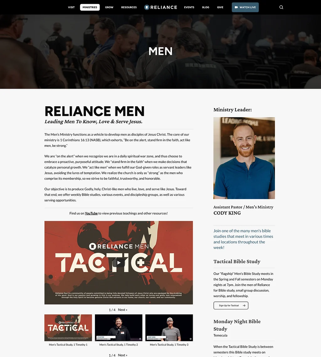
Instead of jamming them all into one massive page, I created individual landing pages for each one. Each ministry got its own layout, while staying consistent with the rest of the site and brand.
Take the Men’s Ministry page. We featured Cody, the pastor leading it, and built a page that’s engaging, informative, and built around clear next steps, from embedded teaching videos to clear sign-up links for every small group or study.
This wasn’t just about visual appeal. Our aim was equipping ministry leaders with a page they could actually use.
08Simplifying the Complex
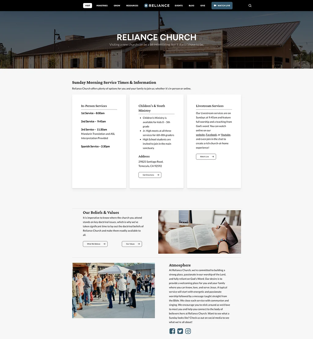
Reliance has multiple service times, formats, and even languages, including Mandarin translation and a Spanish service.
We took all of that complexity and flattened it out into modular info cards. Clean. Clickable. Easy to understand.
If you’re new, you know exactly where to go.
If you’re a returning member, you’re reminded how your church is serving different people in different ways.
09The Most Thorough Statement of Faith I’ve Ever Built
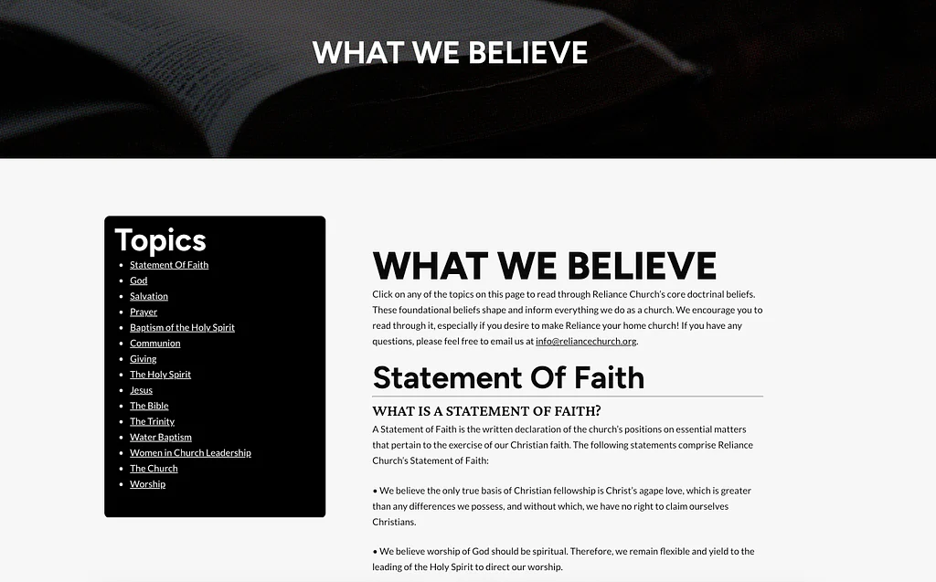
Let’s just say this church does not phone in their doctrine.
Their statement of faith was long, like seminary-syllabus long, but it mattered to them. So we honored it.
We built a left-hand sidebar menu with anchor links to each section, allowing readers to jump to what matters most to them.
Paired with strong, readable typography and clear spacing, this page is proof that clarity and theology can live in harmony.
10Before & After
The original homepage was dominated by full-screen image sliders that offered little real info.
There were no clear paths, no consistent calls to action, and the visual design didn’t reflect the church’s actual identity.
Now? Every page is purposeful.
Every section is intentional.
Every visitor has a path.
11The Quiet Win
A lot of people think design is about flash. I think it’s about clarity.
Reliance didn’t need to look hip.
They needed to feel like themselves, to show their heart, guide new visitors, support their team, and honor their mission.
We did that.
Together.
Website strategy, design, integrations, and staff training.
This account describes the project at the time of writing; screenshots may differ from the current client site.